As far back as our collective memory extends, we've been mesmerised by the dance of the planets across our skies. Even now, despite all our knowledge and technology, their basic movements can still surprise and captivate us.
The waltz between Earth and Venus around the Sun has been doing just that, for centuries - and it certainly does make a stunning pattern.
 (Matthew Henderson)
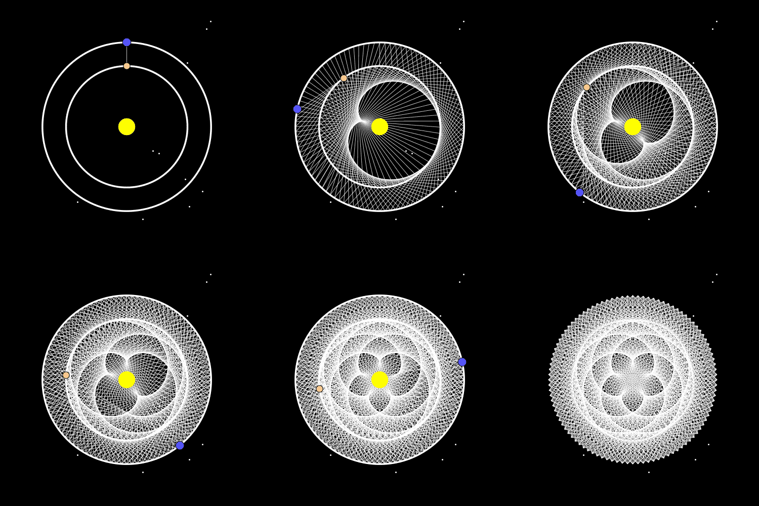
This viral gif, posted by Matthew Henderson on Tumblr, plots the midpoint between the two planets through time - Venus in orange and Earth in blue - as they follow their usual paths around the Sun.
As Henderson explains in the caption, "eight Earth years are roughly equal to 13 Venus years, meaning the two planets approximately trace out this pattern with 5-fold symmetry as they orbit the Sun."
The beautiful animation is based on data from University of Wisconsin geoscientist Steven Dutch, who created an interactive graphic in 2012, demonstrating how Venus's closest orbital points to Earth, over eight years, map out the points of a "remarkable, but not perfect" pentagram in the sky.
"The orbits are approximated as circles, so this animation cannot be used for accurate predictions," Dutch stated.
All planets have elliptical orbits, making these diagrams simplified representations of the real deal. But they aren't radically far off, especially in Venus's case. Venus has the most circular orbit of any of the planets in our Solar System.
In a measure of eccentricity - how much an orbit deviates from a circle - Venus scores 0.007, whereas Mercury, with the most elliptical planetary orbit in our Solar System, has an eccentricity of 0.21. This measurement is the ratio between a planet's farthest and nearest orbital point from the Sun, and gives a sense of how elongated the ellipse is.
Earth's eccentricity is 0.0167, and the Sun isn't central to this ellipse - it's closer to one end.
Another factor that would slightly skew the perfect symmetry depicted in the diagrams is that Venus's orbit is at an angle of 3 degrees when compared to Earth's.
We also must note that in the gif animation, the 8/13 orbit ratio between the two planets is slightly off, too. For every eight years on Earth, Venus experiences 13.004 years, which means the entire pattern rotates over time, like it does in Dutch's original app.
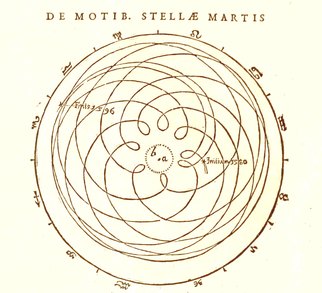
But this idyllic five-fold symmetry is also observed when Earth is placed at the centre of the diagram (a geocentric perspective), known as the pentagram of Venus. Such patterns have fascinated professional and amateur astronomers for centuries - here's what the geocentric motion of Mars looks like, as drawn by Johannes Kepler back in 1609.
 (Johannes Kepler/Astronomia Nova)
The strange loops are not of Mars performing some sort of fancy orbital twirl, they're just how the movements appear to us relative to both Earth's and Mars's movements.
The apparent switching of directions occurs from our perspective when we overtake a planet or it overtakes us, while both planets still travel in the same direction around their orbit at different speeds.
This is known as apparent retrograde motion, and has long been used as fodder for superstitions like astrology, with the nonsensical problem of 'Mercury in retrograde' now having become a full-blown meme.
Of course, modern technology now allows us to visualise these orbital patterns across much greater stretches of time, like the pretty and chaotic examples you can see here. But the only thing these gravity-bound planetary movements reflect is that patterns are a fundamental part of nature. And beautiful to look at, too.
#Space | https://sciencespies.com/space/invisible-dance-of-earth-and-venus-forms-a-stunning-pentagrammic-pattern-in-space/
No comments:
Post a Comment